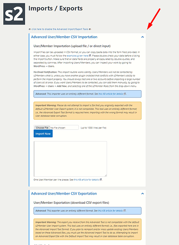
New Version - Width reduced?

Hi! Did you change the width of things on your latest update?

This is really bad because now I can’t use the full width of my browser. :cry:

Please let me know how to “undo” that (I just updated the plugin, was using last year’s version before, which made use of the entire width of my browser’s window)

Same problem on other screens:

I made that change several months ago.

I see what you mean, though. I’ll see if I can make better use of the width in larger screens.

:slight_smile:

2 Likes

Awesome! And yes, I was holding back the update and working with a version that was about a year old since the changes to your plugin weren’t large and your changelog didn’t have any modification for anything I needed.

Since today I started testing things out I updated the plugin and re-edited the user list php file to have the search on notes field available again (since each update means losing any changes I make to your code and I don’t know how to do things differently, sorry).

I work on a 4K monitor (75 inches TV) and I zoom out (67%, 75% or 80% most of the time) so I can fit more stuff. My main window takes about 40% of the width of my screen since I usually have other windows on the side etc.

2 Likes

Thanks for improving it a little!

It would be nice if it didn’t make those areas within the red rectangles that I drew didn’t stretch as you increase the screen width, though (maybe set the width of the useful information using calc (100% - x number of pixels you want on those sides instead of using a percentage and do the same for the margins?)… :grimacing:

For example, “ws-plugin–s2member-log-viewer” has max width set to 85%, where it could be 100% (or you can use calc to offset a fixed number of pixels)

Same thing with the columns inside of it:

Instead of 80% maybe would be better to use calc - the amount of pixels you want, then set the second column to have a fixed width in pixels… :thinking:

I hope my ideas are useful for your next update. Thanks either way. :hugs:

Hi Sim,

I see what you mean… Well, I’ve kept it not very wide so that the content of the boxes doesn’t spread too much. All the inline documentation would just be even more uncomfortable to read and looks bad, too. It won’t be an issue once I move the documentation outside the admin pages, though…

Is your issue with the log viewer only, or do you need all admin pages to stretch as far as your monitor allows?

I do think the log viewer could be wider, but it’s also possible to just download the log file and view it in an editor, which is actually my preference when studying long logs in detail (with highlighting, and search), and use the online one for quick checks mostly.

:slight_smile:

Regarding this style - S2member is the only plugin setting - that breaks together with Ozh’ Admin Drop Down Menu
This problem is not related to the update but persistent since a long long time.

I know Ozh’ is not supported anymore - but the problem nevertheless is a bit strange. If Ozh’ is active - then clicking into the s2member menu structure makes the header bar disappear - and I get the following debug notice:
Deprecated : rtrim(): Passing null to parameter #1 ($string) of type string is deprecated in /var/www/openmtbmap.org/htdocs/wp-includes/formatting.php on line 2772

It means to get to another menu in s2member I then need to go back to wp-admin - then click into the next s2member submenu. It’s not very important but I think this is due to some bug in styling - as all my other plugins don’t have this problem.

Hi Felix,

Interesting behavior.

I searched for that file and line, and see that the rtrim is being used in another fucntion called untrailingslashit. I searched for that in s2, but nothing.

That function “removes trailing forward slashes and backslashes if they exist.” So it’s used on URLs, and if it’s for the navigation, obviously is in the links to the pages.

s2 uses the horizontal lines to separate parts of the navigation, and maybe that has something to do with it? I’d have to try and inspect that plugin’s code to find out…

I do plan to remove those separating lines, and also add navigation in the page itself, not just the sidebar. Maybe that’ll help.

I just tried it. I see why you mention it in this thread, it does widen up the page even more when it removes the sidebar.

I see that the links are gone, or act weird, in the s2 admin pages, but seems fine in the others. I also saw that the dropdown for s2Member doesn’t have those horizontal lines, so it seems to confirm that it may have to do with that.

I searched in the Ohz plugin for those functions, and didn’t find either one. I’ll see if I inspect it more, but maybe it won’t be needed after I implement the navigation changes I mentioned earlier…

I can live with the bug - gotten used to it over the years already. I just thought that maybe it will also without Ozh pose some problems.

1 Like

It looks much better now! Thank you!!!

:jack_o_lantern: :jack_o_lantern: :jack_o_lantern: Happy Halloween Weekend! :jack_o_lantern: :jack_o_lantern: :jack_o_lantern:

1 Like