Hi,
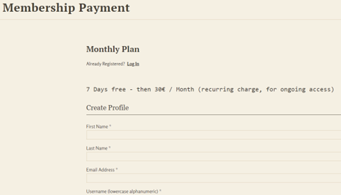
The font on my Membership Payment page that describes the payment is an odd font - it looks clunky like an old typewriter. I do not (to my knowledge) have this type of font set in my css, so am confused why this one sentence has this odd looking font…and I cannot figure out how to change it.
https://www.keytobeing.net/membership-payment-3/ (for an example)
thanks so much for any help
Font on Membership Payment page
If CSS doesn’t help, then you can add a new template in your child theme root directory. I have a file called stripe-checkout-form.php there that changes lots along with custom CSS.
Thanks for your reply - I’m afraid I am not well versed in CSS so do not know how to add a template in my child theme root directory…any help is appreciated.
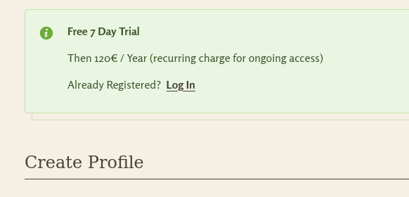
Do you mean this part?

It appears to be using the same font (Rosario) as the rest. Could you show me a screenshot of what it looks like on your side?

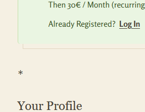
Thanks so much for your reply. No I do not mean what you pasted as a screenshot, I added that because the text itself was so ugly. The text I managed to reduce to an asterisk (*), but I cannot remove it entirely from the shortcode because it gives me an error saying “description missing”. I wish I could just take it out as I like the new text I added.
Thank you very much in advance for any help…!
Axinja
Here is what it used to look like: 
And here is what you see now (the asterisk) - it is small, but looks weird, so needs to be gotten rid of:

I see…
Well, you can style it using the s2member-pro-paypal-checkout-form-description-div id selector…
#s2member-pro-paypal-checkout-form-description-div {font-family: Rosario !important;}
And if you want to hide it instead, then…
#s2member-pro-paypal-checkout-form-description-div {display: none;}

But even if you don’t show it there, it’s good to have something meaningful in the pro-form’s desc, because it’ll be used to describe the charge.

Thank you, thank you, thank you…I have spent so much time trying to get this tiny change done!
I really appreciate your help 
Just one question: if I understand correctly, you are saying it is better not to use the “none” option for description-div? Why is that? Thank you again!
You can hide it, but do have a value for it in the shortcode, because that’s the description used in the charge. Otherwise it’d be blank, and the customer won’t see what the charge is for in his statement, and you won’t see it either. Keep the description, even if you want to use the customized description above the pro-form in green.
Does that make sense? 
I see, thank you very much for explaining this to me!


Hello @clavaque, I am sorry to bother you with this again. I am switching from PayPal to Stripe, because I want to avoid the 30€ monthly fee for enableing recurring payments.
Now I have the same font issue for the Stripe form - however, I cannot find the same type of code in the style.css for Stripe. All I find is code for PayPal - thank you in advance for your help.
Did you try this?
#s2member-pro-stripe-checkout-form-description-div {font-family: Rosario !important;}
or
#s2member-pro-stripe-checkout-form-description-div {display: none;}

Hi folks, will this method still work in 2024 Updates? Thanks, Roger.
Hi! If you don’t mind me asking, why would you have to pay 30 euros per month for that? I didn’t receive any notification from PayPal saying they’re changing.
Can you continue to use PayPal without their pro features, but only the basic buttons, instead? I still receive my subscriptions normally from them without their professional upgrade thing (I forgot the name of that service, which was paid years ago when I started, hence why I never used it).
Also, you can have both and Stripe now integrates PayPal in it, you can connect both so people can use your stripe form while paying with paypal, if they’d like (or link, Stripe’s own alternative).


