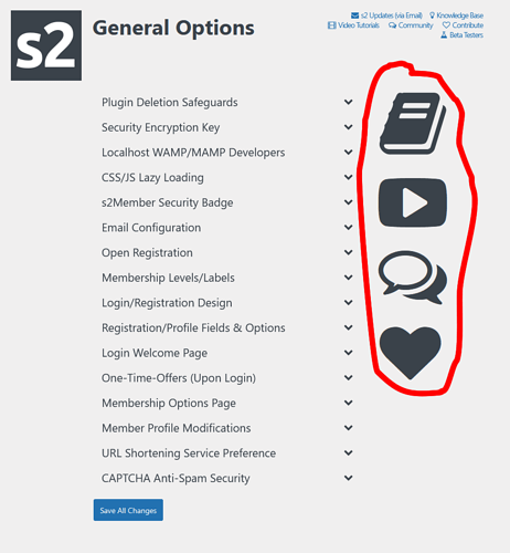
Admin area GUI gripe

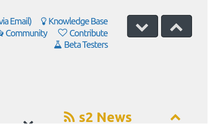
Could we please have the “Expand all” returned to the Admin area?

It’s removal and the sudden expansion of the “ws-menu-page-table-r” icons only served to reduce the working area of the admin area and force me to click/expand all the admin sections every time I go to make a change in the admin area.

I don’t think these icons need to take up so so so so so much space.
Thanks :pray:

Thanks for the feedback, Gerard.

I’ll think about the “expand all”. I honestly didn’t think anyone would miss it, since the page gets so long when all panels are expanded.

I’ll be making more improvements to the admin layout to make better use of the space, and also reorganize to have less things per page, if possible.

:slight_smile:

It can be useful. Even if only rarely necessary. If the code is there and easy to be brought back, it’s a neat feature in my personal opinion, but I can always be wrong, of course. :innocent:

https://s2member.com/s2member-v230808-now-available/

Screenshot%202023-08-15%20at%2014-11-39%20s2Member%20General%20Options%20%E2%80%B9%20s2Member%20Membership%20Plugin%20for%20WordPress%20%E2%80%94%20WordPress

:slight_smile:

2 Likes